Our newest TOA of ice (Or cold as the latest catalog phrases it), and going by the polls he seems to be everyones favorite so we will start with him. Ill show some inner anatomy with this guy that I wont show in the others, since they are essentially the same torso give or take one of the two types of chest plates and the necessary inner arrangement to hold that chest plate on. Ill also not be repeating myself on some of the part descriptions as that will clearly get repetitive and annoying later on. Lastly Ive included some speculation and debate from talking to PREDATOR (our new U.K. news reporter), I wont exactly name the specifics but I dont want PRED to go un-credited for his work
Toa MATORO consists of a mostly white color scheme with a silver torso and transparent blue for the secondary color. What I really appreciate is how he is not that annoying off white as seen in THOK, so the parts will be more compatible when mixing them into older toa parts and the like.. Every socket within MATORO is a sort of light sky blue and nicely transparent, while I have speculated a toa built entirely from a clear part assortment would have been great this is a nice compromise. One of the features that stand out the most in all the INIKA would be the new legs, which have a more industrial look to them. The lower leg going from knee socket to ankle socket is only a space or two longer than the VAHKI lower legs that make up MATOROs lower arms. The knee guard as I call it is nice and sturdy and overall just looks cool. It was one of the features that stood out amongst the early pictures we saw of the toa INIKA. The upper leg armor, like the PIRAKAs is not symmetrical from top to bottom, where as if you cut the TOA METRU sets upper leg armor youd have mirrored pieces if you cut it from either the horizontal half or the vertical half. The lower half which is flatter on the upper leg armor is intended to give MATORO a wee bit more flexibility at the knee, though if he didnt have that knee guard that got in the way I wonder if the upper leg armor would have been symmetrical from both the vertical and horizontal? I will also add, though maybe it was a mistake, TOA HEWKII is the only of the TOA INIKA where the instructions show the bigger end that gives less mobility is placed downwards. The directions clearly show to do that, however, HEWKIIs box shows it the same way the other INIKA have their upper leg armor attached. Looking at the side of the leg is not such a grand sight on the other hand, just a plain leg side with some reinforcing architecture.
Similar to how the PIRAKA have two different feet styles, the INIKA also have two different types, also of mention is that the toa INIKA have two chest plates as well. MATORO features the one I call the toe foot, after the four little toes, while the other foot, well I have yet to think of a good nickname for it. This toe foot is rather similar to TOA METRU feet when it comes to ports to build with, it has the peg to attach the ankle socket and the familiar three holes around that port with the plus rod for the ankle socket to slide into. Getting into the torso, In MATOROs case its all silver with the exception of the white hip parts. I would have been very happy to have this familiar hip in a new color like the ones in the PIRAKA, but the only one sporting a new waist is TOA HEWKII in KEETONGU yellow. For MATORO the torso being one solid silver color, at first glance you might mistake the back and front of the torso to be a solid piece, but thats because the front and back with this particular of the two torsos blend together well. Its a bit easier to see that torso type two is indeed not actually a part of the back parts from how the armor extends around the sides of the toa a ways. My biggest complaints about the torso, a, it just seems a tad too wide and plat, plus lacks a mechanism for the sake of articulation. b, the spot where the socket for his neck attaches does not hold the socket completely still, as it can move sideways about half a millimeter and makes the head feel shakier. Now that I think about it, his silver torso looks more like armor than apart of him, as the rest of MATORO is mostly white and crystal blue, especially if compared to NUPARU, who’s torso is black and matches his limbs, but this gives us more diversity amongst the toa, the downside being that MoCers wont necessarily find a green armored shoulder plate on a green toa, but he could find a black one on a black toa. In short it’s a drawback from one angle but an advantage in diversity from another, since a lot of you will be wanting the silver shoulder armor on KONGU. As I intended to say with the TOA METRU, they were pretty much the same set in a different color with a different tool and mask, so you had all the same parts in the standard toa colors, and could easily find what you needed by selecting TOA MATAU for all the green parts for example.
Getting into the arms, theres nothing really new except the colors and the shoulder armor. The new shoulder armor is rather good, plenty of places to attach stuff and it also looks cool. To a small degree you can compare it to the toa METRU in concept, skinnier at the middle of the arm and wider at the top, only this time they have a little cut out niche to give him some more articulation when he moves the arms side to side. The armor seems to include a couple slots perfect for attaching other parts like those rubber pieces with the circular tip that add to the zamor launchers functionality. In act a lot of the newer parts in the PIRAKA and the upper leg armor also have the properly fitting circular holes. The shoulder armor is attached by sliding a three long peg through the side and into the holes in the arms. It can attach to the bottom or middle slot, in MATOROs case its at the middle slot. This gives MATOROs shoulders a more raised look, and more articulation in the elbows, but at the cost of far less articulation when he moves his arms upwards from the sides, where as if it were plugged in a slot lower hed have a little less elbow movement and more range of motion in the shoulder. I should also say that the armor’s design prevents it from being plugged into the highest of the three slots, a slight disadvantage but very few of you I imagine will have needed that for a MoC or something. Last of all, the armor isnt a snug fit on the upper arms at either of the two slots, so it kinda rattles as you move him. This is a drawback as it makes the armor seem less apart of him buy adds to the realism in that it seems more like a knight’s armor clakking back and forth. Also of mention is that it doesn’t move more than a centimeter when it rattles, so only the most picky of people will find it annoying but I think depending on how they think of it, it won’t be annoying at all.
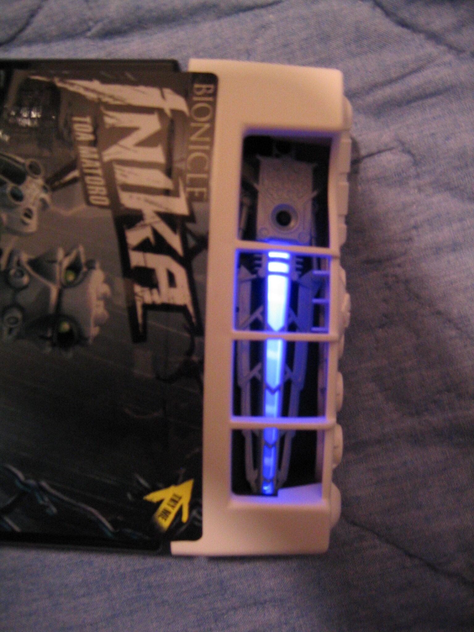
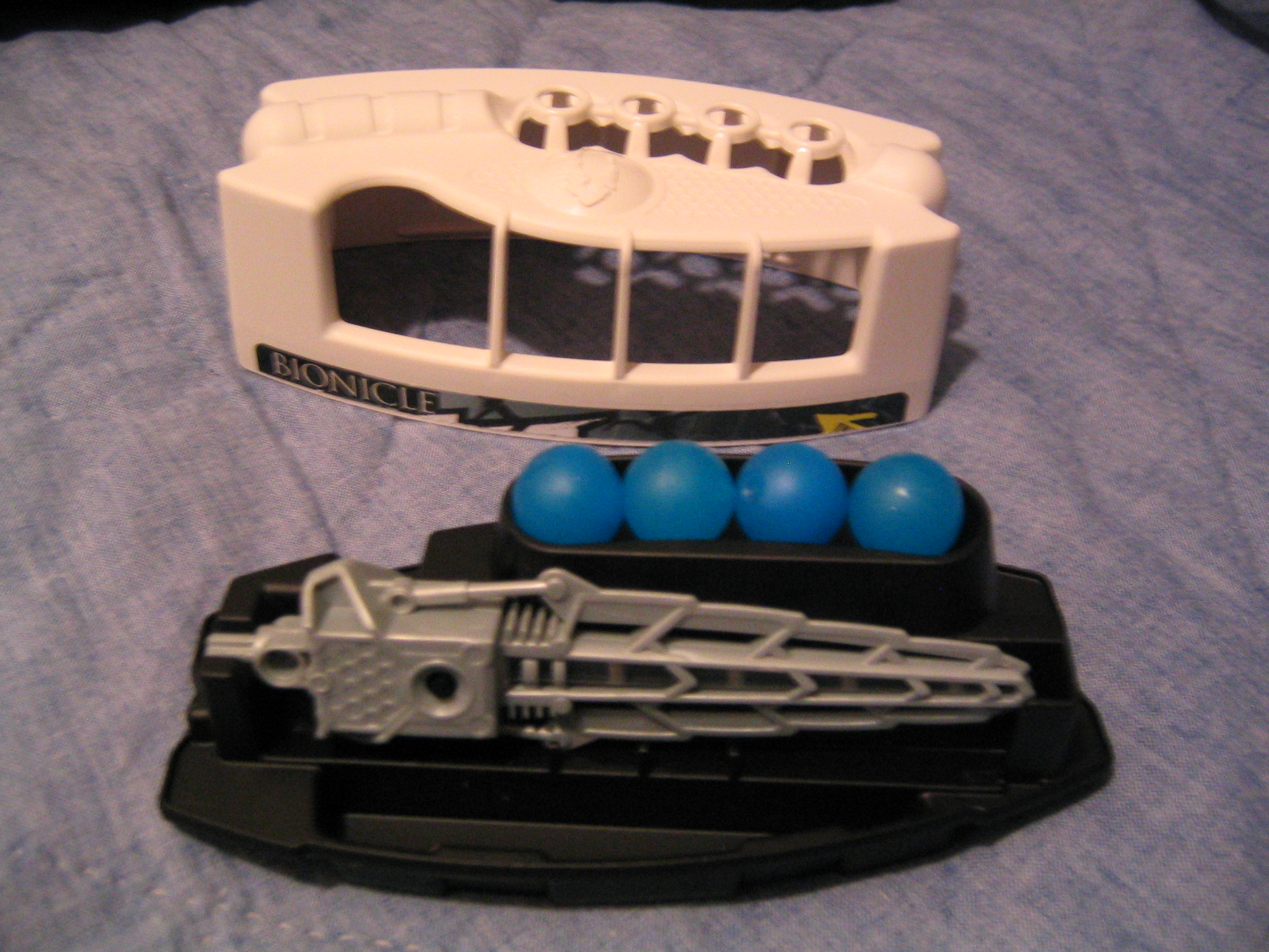
Of course at the ends of those arms are his two tools, the ZAMOR launcher with the clip to add three more shots, and his strobe light sword. One drawback is that all the tools have this sort of box and a rather clear warning label etched in the plastic of the battery cover, and YES the batteries as shown in one of PREDs pictures earlier can be replaced, however it would be at a cost as those tiny batteries are expensive for us consumers. Drawback number two, all the tools share this rather bulky box at the base that houses the batteries and the rubber button to activate it. Once pressed, the clear tube in the center of each tool flashes slowly about three times and then starts to rapidly strobe, after a few seconds the strobeing abruptly slows and then stops, giving a nice power up and power down effect. The button is recessed a ways into the plastic and adequately prevents accidental start ups. The flashing is a rather bright and satisfying blue, the canister implies that a sort of dot shoots outwards from the sword, which it does not as solid plastic covers the tip of the light up end on the tools. However the light does color any adjacent walls or objects like a mini flashlight (I wouldnt recommend actually using it to find stuff in the dark though). I imagine its this way cause if you could look directly into the LED via the tip it would be pretty bright. In the other hand, well its just a your basic zamor launcher with a nice clip to hold three more shots. My biggest complain though id the topmost of the four loaded zamors doest stay in too well, as the criss-crossing ribs leave a bit of a gap to one side so that it would fall out. That would be easily fixed but the clip would have less style to it, plus the criss crossed ribs make it excellent to display your zamors in. Not only that it looks like if you have enough you can hook a bunch of clips into a giant ring of clips you could hang on the wall. I imagine Ill use this concept to build the inter-dimensional gate for my gatekeeper MoC. I imagine many of you will use this for stargate( ® ?) spoofs as well, especially since you can sorta rotate the zamors through the ring to dial it. A big problem though is these guys are ( *gulp*) 9.99 each, about a dollar more than the previous canisters, but with rising oil prices and what these sets come with, well the LEGO company is giving us a break and likely not profiting as much as they could off these guys in order to keep them affordable to us. Getting to the canister, as you may have noticed from PREDs comparison picture, they are quite big and accommodating, I could fit MATORO in his canister without removing any parts though I admit it was tricky. PREDATOR showed us the “underlid” too, which was basically in between the opening in the canister and the lid on the top. The lid and underlid have a few teeth to hold the tools in place and something like a bowling ball rack to align the zamors with the grate at the top of the lid to demonstrate the zamor ammunition. Also of note, you can slowly peel the sticker off and get little or no residue if you get annoyed with the sticker on the canisters getting in the way of closing the lid again. On the subject of the lids, these have got to be the coolest lids yet, perhaps next to the dome lids of the VISORAK with the bubbles in them.
Hmm, what am I forgetting? Oh yes, the head/mask. My biggest complaint about this set and all of the INIKA is the head, the masks are quite cool but these little green blobs are annoying. Without the mask, you see this big green and white multicolor hard plastic blob stick out. No face underneath the mask, so the mask might as well be the actual face, which in one sense it is, but I liked the idea of the removable mask to show the toas head underneath. Oh well, weve seen this before with the TOA HORDIKA, and its the same concept, so if you put up with them you can put up with these guys heads. The mask itself on MATORO is outright one of the cooler ones (by my opinion, but I think a lot of you guys agree with me). The plastic for these masks is kinda rubbery, but not by much. Its nowhere near as flexible as the PIRAKAs spines or a krana. Complaint two, these masks arent really compatible with older toa heads, only the green blob things which they clip on to. Dissadvantage of blobs, ugly and lack detail without the mask on, no compatibility with older masks. Advantages, hallow space under green blobs in which to potentially add a feature for MoCs. Getting into the neck, it actually holds together pretty well, plus the best part, its got the new technic ball which a plus rod can pass completely through! Ive always wish theyd make this part, and they did! Downside is you only get one with these guys, or two with AXONN and BRUTAKA, but if you need two, you have the choice of one Ax or Bru or two INIKA at about the same price.
Overall, MATORO is a well rounded set, if you dont like him, his parts are excellent for MoCs, as are most TOA INIKA. The joints are kinda loose like how the PIRAKA were when they came out, and feel like they are already broken in but without too much wear and tear. That about sums it up for this guy, I cant go into any more detail at this point without feedback so Ill try to answer what I can from here on in the forums. Please enjoy the pictures and zoom in so you can see more detail (assuming you have the program to zoom). As I said before MATORO being the first set in the review Ive covered most of the speculation and description for the newer parts in him so I wont really talk about those with the rest to come but instead talk about their uniqueness and differences. be sure to thank PREDATOR too, as he was a big help with this review and getting the us our first look at the TOA INIKA, I wouldn’t want his work to be forgotten now that I have my own review up. Lastly, I must say the pictures shown of the sword strobeing do not accurately depict the effect, you really have to se it in person to see how cool it is.


0 Comments