This week we’re back again with more 2005 content… and our very last Book vs Movie comparison!
When we released our comparison for Legends of Metru Nui, we promised that it wouldn’t be long before our fourth and final Book vs Movie comparison. Now that day has finally come, following on the heels of our 2005 comic novelizations.
Like each of the other BIONICLE novels, the novelization printed by Scholastic was originally based on an early version of the movie script, incorporating elements that didn’t make the final cut. It’s well known that an infamous scene with Matau building a nest and asking Nokama about her “primal urges” was cut between the original and final versions, but less known are the absence of any mention of “viceroy” in the movie (referring to Roodaka as either “queen” or “not yet [queen]”. Also absent from the book are many of the arena fight scenes, instead featuring the Toa attempting to descend into the Coliseum only to be thrown out again.
Any element that was added to the movie that wasn’t originally featured the book has been novelized by our team and can be viewed seamlessly with the rest of the story.
As always, the fruits of our labors can be found in the pdf below, based on the digital edition of Legends of Metru Nui found on our sister site, Wall of History. We hope you enjoy the breakdown!
Font colors are to be understood as follows:
- Red = Line from the book, perhaps representing a sequence in the original script
- Green = Addition made for the movie
- Orange = A scene or line that was moved to a new spot
- Purple = The new spot for a scene or line that was moved
But wait… there’s more!
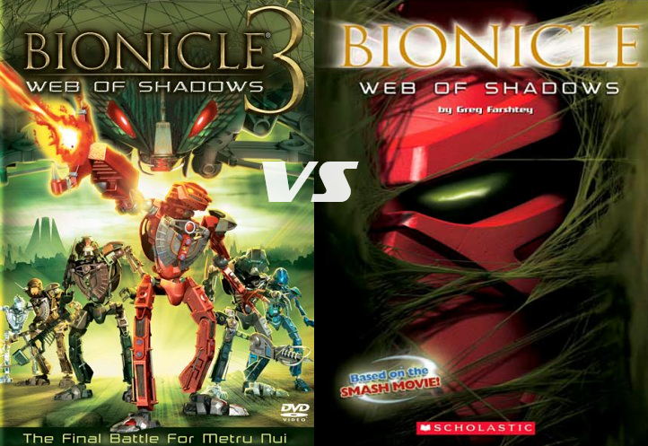
As many of you will know, BIONICLE Adventures 9 isn’t the only novelization for BIONICLE 3. BIONICLE Adventures 7 also featured several scenes from the movie. Very strangely, it is difficult to tell whether it came before or after the BA9 novelization as many of its lines are closer to the movie, but others are more different than the other novelization.
So, taking the above novelization, we’ve imported all these changes into Wall of History‘s Web of the Visorak novel. And if you thought the font colors were difficult to track in the other comparisons, just wait until you see this.
As WotV is an expanded version of the whole first few scenes of the WoS story, we’ve imported everything from those two versions into WotV that was missing in the original novel for a full viewing experience. Any prose text (black font in the above comparison) that isn’t represented in WotV is added here in gold, while silver represents prose text from WotV that is either not compatible or not represented in either version of WoS. Blue additions represent our own small additions that reconcile the continuity of the adventures and/or the narrative. Not highlighted are elements present in WotV that are missing in one or another of WoS, but these are fairly easy to find.
With all this laid out, one can get a full view of these first few scenes. (Excluding the comic adaptation… we’ll probably get to that later…)
Font colors are to be understood as follows:
- Blue = A fanon line added to reconcile the continuity or narrative of WotV with WoS
- Silver = Line from WotV that either conflicts with or is not present in either WoS version
- Gold = Line from both versions of WoS that is not present in WotV
- Red = Line from the WoS book, but not in the WoS movie
- Green = Line from the WoS movie, but not in the WoS book
- Orange = A WoS book scene or line that was moved to a new spot for the movie
- Purple = The new spot for an orange scene or line that was moved
NOTE: The full book of WotV is here, but the chapters of note are Chapter 2, 8, and 9.
0 Comments