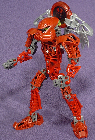
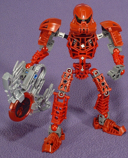
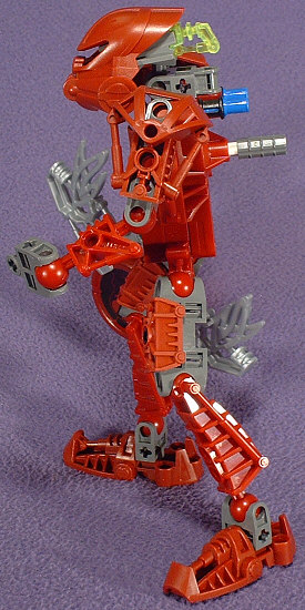
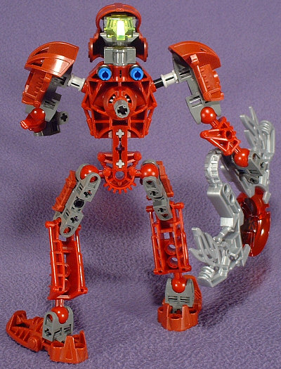
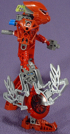
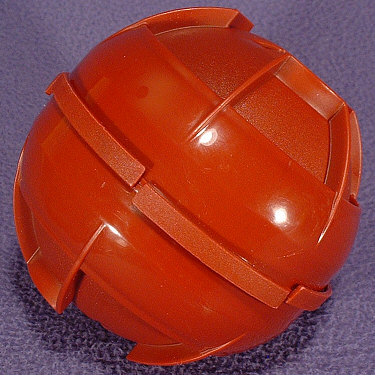
The TOA METRU sets are a pretty even mix of pros and cons. On the plus side, they’ve got knee and elbow articulation, and fully posable hips. On the minus side, they no longer have ball-jointed shoulders. On the plus side, they have adjustable height. On the minus side, it doesn’t work so well with mixed colors. On the plus side, they have ball-jointed necks. On the minus side, only two of them come in traditional primary Toa colors. On the plus side, they have double-ended socket joints. On the minus side, those parts only come in the new gunmetal grey, which looks horrible with the 20-year old classic dark-grey that it’s permanently replacing. On the plus side, VAKAMA comes with one of the TOA KANOKA. On the minus side, he also comes with a weapon that’s largely worthless with the standard TOA attack mechanism. On the plus side, the eyepieces are easily removable. On the minus side, he’s got a bright white dot in the middle of his chest (a very odd color choice, considering the much darker color pallete of this batch).
I’m not against the idea of introducing new colors into the mix, but I like them to be fully compatible with all of the previous sets. In other words, I like new parts to show up in core colors, and I like new colors to be introduced with older parts. Starting out a new year with a dozen small sets that come with a bunch of new parts in a bunch of new colors doesn’t leave much backwards compatibility with the previous three years worth of sets. There are certain things that dedicated MOC builders have been waiting to see for a long time, and more red BIONICLE™ limbs was one of them. Dark-red doesn’t quite fit the bill (ironically, there are now twice as many dark-red limb pieces as primary red ones). In a perfect world, we’d be able to get every BIONICLE piece in any color we want, but in a realistic world, it’d be nice if we could at least expect new pieces to match our existing collections. There’s the promise of a lot of potential in some of these designs, but the only way to make the most of them is to stick to black or white MOCs.
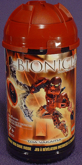
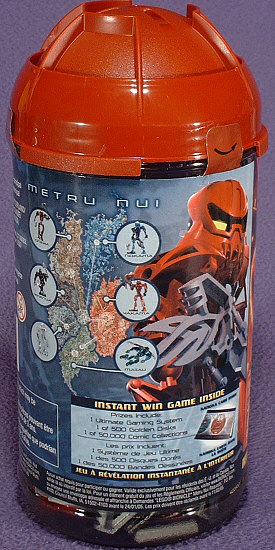
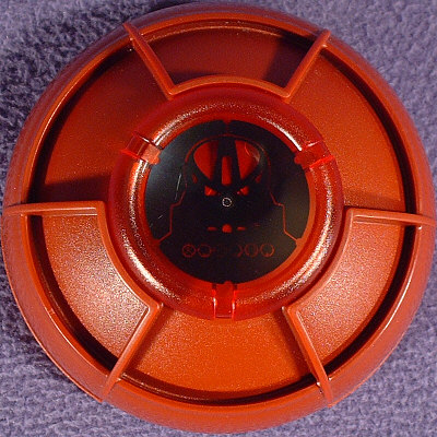
The packaging offers some interesting possibilities. Two can tops can be snapped together into a ball…though we don’t quite know why yet (this feature looks to be quite popular amongst traditional Space fans). Additionally, the very top is shaped to hold one KANOKA disc. It’s not quite as useful for displaying a full KANOKA collection as the TOA/TOA NUVA lids were for KANOHI, or the RAHKSHI lids were for KRAATA, but there are supposed to only be six GREAT KANOKA, so it’s good enough for them (coin sheets, I believe, are the chosen method of THROWBOT collectors).
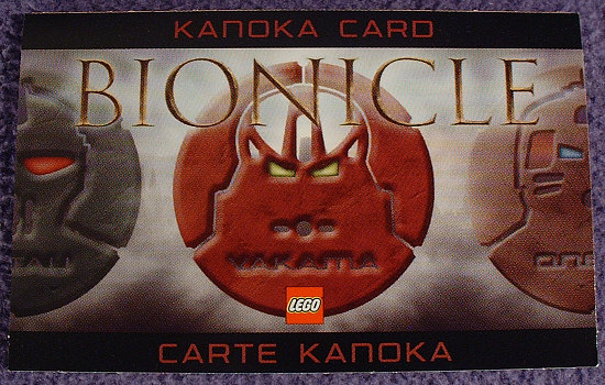
An odd new addition is the KANOKA Card. On the outside, it has an image that’s appropriate to the set that it came from. On the inside, it tells you “SORRY, TRY AGAIN”, unless you’re lucky enough to find one of the 50,501 winning game cards. Ironically, the coolest prize piece (a limited edition Golden KANOKA) is only listed in the First Prize, and the lone Grand Prize winner apparently goes without.
Even if you didn’t win, there’s still something to do with your KANOKA Card. Starting in February, with the relaunch of the official website, there will be a place to enter and track your KANOKA Points (TOA METRU are worth 180 points). Unfortunately, the points are not redeemable for anything, so it’s just a cute gimmick beyond trying to collect one of each card design (trading card pages should work decently enough for these, though they’ll have a lot of extra side-to-side room).
0 Comments